TITLE: Not Your Father's Data Set
AUTHOR: Eugene Wallingford
DATE: December 12, 2007 1:02 PM
DESC:
-----
BODY:
When I became department head, I started to receive a
number of periodicals unrequested. One is Information
Week. I never read it closely, but I usually browse
at least the table of contents and perhaps a few of the
news items and articles. (I'm an Apple/Mac/Steve Jobs
junkie, if nothing else.)
The cover story of the December 10 issue is on the magazine's
2007 CIO of the Year,
Tim Stanley of Harrah's Entertainment.
This was an interesting look into a business for which IT
is an integral component. One particular line grabbed my
attention, in a sidebar labeled "Data Churn":
Our data warehouse is somewhat on the order of 20 Tbytes
in terms of structure and architecture, but the level of
turn of that information is many, many, many times that
each day.
The database contains information on 42 million
customers, and it turns data over multiple tens of terabytes
a day.
Somehow, teaching our students to work with data sets of
10 or 50 or 100 integers or strings seems positively 1960s.
It also doesn't seem to be all that motivating an approach
for students carrying iPods with megapixel images and
gigabytes of audio and video.
An application with 20 terabytes of data churning many times
over each day could serve as a touchstone for almost an
entire CS curriculum, from programming and data structures
to architecture and programming languages, databases and
theory. As students learn how to handle larger problems,
they see how much more they need to learn in order to solve
common IT problems of the day.
 I'm not saying that we must use something on the order of
Harrah's IT problem to do a good job or to motivate students,
but we do need to meet our students -- and potential students
-- closer to where they live technologically. And today we
have so many opportunities -- Google, Google Maps, Amazon,
Flickr, ... These APIs are plenty accessible to more advanced
students. They might need a layer of encapsulation to be
suitable for beginning students; that's something a couple
of us have worked on occasionally at ChiliPLoP. But we all
have even more options available these days, as data-sharing
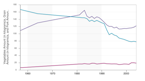
sites a lá Flickr become more common. (See, for example,
Swivel;
that's where I found the graph shown above, derived from data
available at the USDA's Economic Research Service website.)
-----
I'm not saying that we must use something on the order of
Harrah's IT problem to do a good job or to motivate students,
but we do need to meet our students -- and potential students
-- closer to where they live technologically. And today we
have so many opportunities -- Google, Google Maps, Amazon,
Flickr, ... These APIs are plenty accessible to more advanced
students. They might need a layer of encapsulation to be
suitable for beginning students; that's something a couple
of us have worked on occasionally at ChiliPLoP. But we all
have even more options available these days, as data-sharing
sites a lá Flickr become more common. (See, for example,
Swivel;
that's where I found the graph shown above, derived from data
available at the USDA's Economic Research Service website.)
-----