TITLE: Graphic Art: Links in Jewish Literature
AUTHOR: Eugene Wallingford
DATE: August 12, 2015 10:09 AM
DESC:
-----
BODY:
"Genesis 1:1 is the Kevin Bacon of Sefaria."
This morning I finally read
Sefaria in Gephi: Seeing Links in Jewish Literature,
which had been in my reading list for a few months. In it,
Liz Shayne introduces a collaborative project to visualize the
relationships among 100,000+ sections of Jewish literature
encoded in
Sefaria,
an online library of Jewish texts. It's a cool project, and
the blog entries about it remind us how beautiful visualizations
of graphs can be. I love this basic image, in which nodes
represent sections of text, color indicates the type of text,
and size corresponds to the degree of the node:
This is suitable for framing and would make a fine piece of art
on my office wall.
Images like this can help us to understand a large dataset at a
high level more easily than simply looking at the data themselves.
Of course, creating the image requires some initial understanding,
too. There is a give-and-take between analyzing the data and
visualizing it that mutually reinforces our understanding.
As I mentioned in
a December 2004 post,
sometimes a computer scientist can produce a beautiful picture
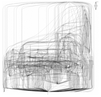
without intending to. One of my grad students, Nate Labelle,
studied package dependencies in Linux as part of a project on
power laws and open-source software. He created this image
that shows the dependencies among one hundred randomly selected
packages:
Unlike the neat concentric Sefaria image above, Nate's image has
a messy asymmetry that reflects the more decentralized nature of
the Linux ecosystem. It evokes for me a line drawing of a book
whose pages are being riffled. After all these years, I still
think it's an attractive image.
I have not read the rest of the Sefaria blog series, but peeking
ahead I saw a neat example in
Sefaria III: Comparative Graphing
that shows the evolution of the crowd-sourced Sefaria dataset
over the course of four months:
These images look almost like a time-lapse photograph of a
supernova exploding
(
video).
They are pretty as art, and perhaps instructive about how the
Sefaria community operates.
The Ludic Analytics site has links to two additional entries
for the project
[
II
|
IV
], but the latest is dated the end of 2014. I hope that Shayne
or others involved with the project write more about their use
of visualizations to understand the growing dataset. If nothing
else, they may create more art for my walls.
-----